
Customization of Salesforce.com Help Text Bubbles in Visualforce
Recently I had a few requests to add Salesforce’s help text bubbles to custom Visualforce pages, in places that did not have fields. Normally the only way you can leverage Salesforce’s help text is via the pageBlockSectionItem Visualforce tag. However, by doing some investigation of Salesforce’s native page layout functionality, I came across how they render these help text bubbles.
Warning: if Salesforce changes their user interface or how they display help text, any custom Visualforce pages you create with the following source code will not be updated (and may even break if the images or CSS gets removed from Salesforce).
You need to ensure that the standardStylesheets attribute on the
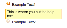
<span class="helpButton" id="example-title-_help">
<img src="/s.gif" class="helpOrb"/>
Example Text
  <script type="text/javascript">
    sfdcPage.setHelp('example-title', 'This is where you put the help text');
  </script>
</span>
This is how Salesforce’s HTML / JS is set up. The key here for the help text icon is the two CSS classes on the and tags. The key for the actual functionality of showing the tooltip is the tag ID, and then referencing it using the sfdcPage.setHelp() javascript method (ensuring to discard the “-_help” from the id. This method is part of Salesforce’s javascript library (whether or not they intended for anyone else to leverage it). Of course, you can move the javascript outside of the HTML for cleanliness.
I found that my help text bubbles were a bit off vertically from my text, so I ended up having to add the following CSS:
/* Needed to move help text bubbles down in line with the titles */
img.helpOrb
{
  vertical-align: bottom;
}