
Salesforce.com Touch Customization Possibilities…are Limited
I spent some time investigating Salesforce’s Touch application (not to be confused with their Touch SDK) in an effort to understand how much we could leverage it on client projects to satisfy the desire for mobile access to data but with a limited budget. In short, it is extremely limited if you want to surface any type of customization that you might have made in a Salesforce organization. Take a look at this list of unavailable features from the full Salesforce website if you want some reading material, though I’ll point out what the biggest limitations (in my opinion as a developer) are below.
As a quick summary, Salesforce’s previous mobile offering was what is now called Salesforce Mobile Classic, an iPhone / Android native application that provided some offline access but had a per user license associated with it for the full version (a lite version is available for free but only supports standard objects). For the last year or two, Salesforce has really been pushing Hybrid mobile applications as the future, and sure enough Touch is their official Hybrid application for accessing data on mobile devices.
Touch has a lot of nice features for someone who simply wants to view and create records, and view some dashboards (typically a normal to light user). Since it is developed in HTML5, it has the advantage of being able to be accessed via your phone or tablets browser without the need to install an app (note that you have to enable access to it for your users). Alternatively, iPhone/iPad users can download an app from the App Store (should be coming soon to Android) that makes the same application available as an app. The difference between these two (web browser vs app) is extremely minimal — to a random person they would look exactly the same.
Where Touch starts to struggle is when you want to introduce a visual way to improve the flow of a users experience. The traditional clicking around to get to and edit records can start to be frustrating when a user has to repeat the same process multiple times on a daily basis (which typically manifests itself as a lot of clicking and data entry). On Salesforce’s normal desktop sized interface, this is typically resolved by introducing either some sort of custom button that launches a Visualforce page that consolidates a lot of actions, or if possible that consolidation can happen behind the scenes in workflow rules or triggers.
Additionally, offline storage is becoming a hot topic for mobile applications, as everyone who uses their phone regularly has found times during their day that they lose access (whether it is a dead zone, on the subway, in the middle of a building, etc). In a world where every second counts, dollars are lost every time a user can’t do their job. The fact that Touch does not currently support offline storage introduces the potential need for custom mobile applications if a company is serious about their team being mobile ready.
What you can customize
As I mentioned above, Touch is really good at what you expect out of a Salesforce organization — creating and editing records. If you want to expand beyond that…good luck. In terms of “customizing” the user experience, below are the only items of value I can see.
- Page Layouts reflect field changes that you make within Salesforce
- The exception here is that there is a limit on the number of fields you can display in Touch (I think around 80). Otherwise it displays an error.
- No custom Visualforce pages or S-Controls will get displayed in Touch even if they are on the Page Layout
- Custom Visualforce tabs (if enabled)
- The Visualforce page gets surfaced in a new browser window. There is no real “integration” with Touch as a user experience besides the fact that you remain logged in to Salesforce.
- The best use case I can think of for these is some sort of custom record creation screen or a page that surfaces data from a third party API in read only fashion. Using Canvas here is probably what it is intended for.
What you can NOT customize
- Offline Storage
- Unfortunately you can’t implement what Touch doesn’t.
- Custom buttons
- Custom buttons on records and related lists are not supported. This is usually where my Visualforce pages get surfaced, so by not supporting these most of my use cases are not viable.
- Custom web tabs
- Similar to Visualforce tabs, but this normally is where you would simply surface a website. This isn’t as big of a deal because you can just iframe your website in a Visualforce tab if you need to.
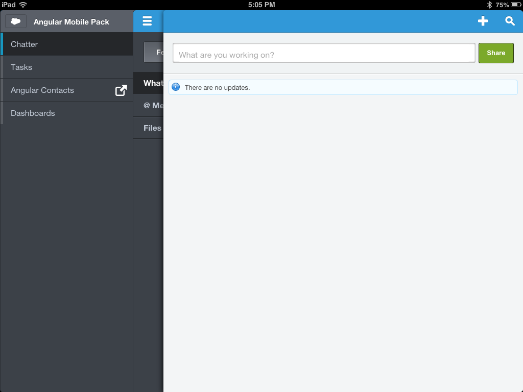
Below is an example of what a custom Visualforce Tab looks like in Salesforce Touch.
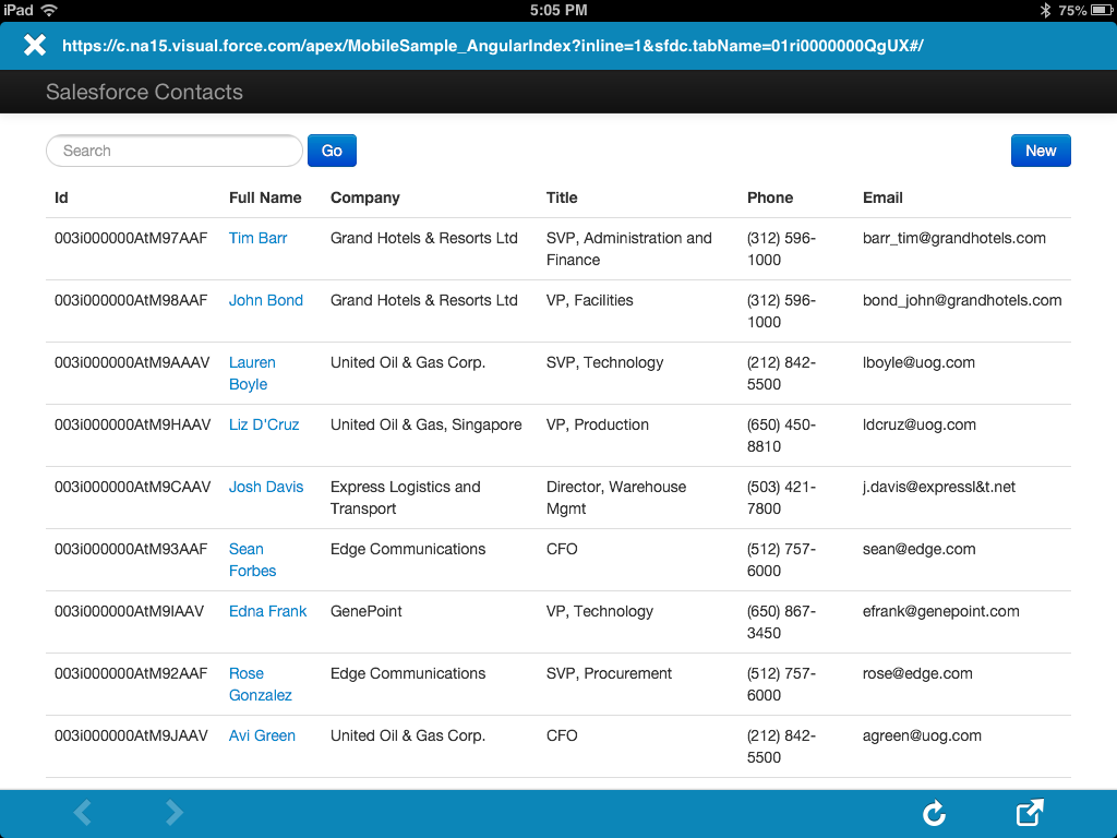
And this is what it looks like when you click on the Visualforce Tab (this example is within the iPad application). Note the header (with URL) and footer…these do not go away.
Takeaways
In my opinion, the biggest drawback when thinking about the ability to customize Touch is that you have no ability to surface a custom Visualforce page within the context of records. In my experience, navigation to Visualforce pages is done at least 5X as much from a custom button a record rather than a Visualforce tab. In addition, the times that Visualforce tabs are leveraged, they tend to be very data heavy pages. An example of this would be a page that allowed the user to do a mass creation of records at once, something that isn’t normally part of a mobile users use case.
To be fair, Touch shouldn’t be expected to replicate the entire Salesforce experience for users. However, it is pretty easy to see that if you are looking for a more streamlined experience on mobile that fits your business process more closely, you are probably looking at a custom solution. For a really cool example of replicating a day in the life for a user (and cutting out the aspects of a CRM that aren’t used and confuse people), take a look at the New Belgium Beer Ranger Windows 8 tablet application (a really cool use case) or sign up for the Sonoma Partners Mobility Test Drive (my employer, a shameless plug).