Goal Accomplished: A Simple Native iOS App on the App Store called PaceMyRace
It’s been a long time coming, but I can finally check off Publish an iOS App off my list of goals for the year with the release of PaceMyRace. As mentioned recently in my midyear review, I decided to take it upon myself to forget the excuse of waiting for Swift and iOS 8 to ship and just build a stupid simple Objective C application. I just needed something I could build in a weekend, and luckily I came across something I needed that did not require persisting any data or any external data sources. Perfect!
Background
Back in mid July, we ran another random race (we’re still trying to qualify for 9+1 NYC Marathon guaranteed entry for 2015). One of my pet peeves when I use apps like RunKeeper (which is an awesome app) is that when I reach the end of the race, I know my time but my distance is always wrong. It’s not a matter of whether there is additional distance tracked on my run, but how much extra. On this particular race, it was only an extra .03 miles on a 3.1 mile race; however, my goal for this race was to get under a 9 minute pace. I ended up with a time of 27:53, which gave me a deceptively wrong pace of 8:55 minutes per mile (against a 3.13 mile distance). In an effort to figure out if I hit my goal, I had to open up mobile Safari, do a Google search, find a rather clunky website, and check my time against the actual race distance. I’m glad to say I barely made it: 8:59 minutes per mile.
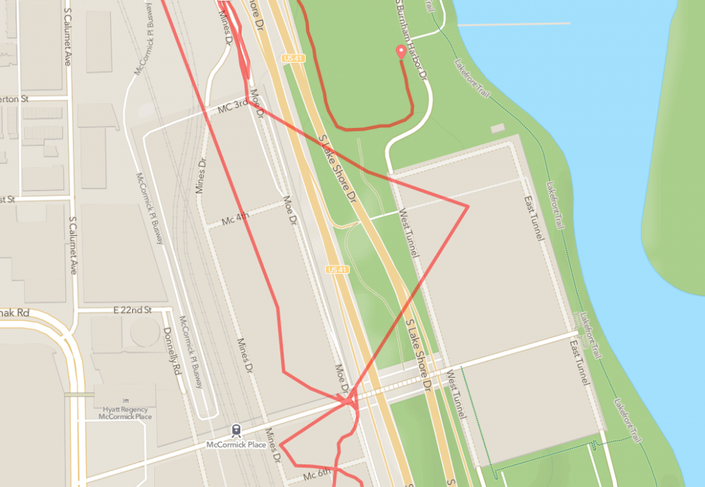
Unfortunately, that was one of the more accurate distances that I’ve tracked during a race. Last weekend at the Big10 5K, my RunKeeper data tracked 4.64 miles instead of 3.1 (there was a long tunnel involved and the GPS lost connection). RunKeeper then congratulated me with a badge for running my fastest time ever at a 6:12 pace. Unfortunately for my ego, that was nowhere near true. Once again I had to rely on the same website to figure out my actual pace.
In the past I’ve typically just tried to do the math in my head and was happy with an approximation, but at this point I realized that I’d rather just have something that I could quickly look up the actual values. I did a quick search on the App Store and found that the existing apps were kind of ugly (there isn’t really money to be made in this particular market). Combining my goal of making an app with the sheer simplicity of this personal need, it was the perfect excuse to spend a Saturday night cranking out the MVP.
The Build
As I noted last month, it has been a long time since I’ve even looked at any Objective C code. I went through quite a few tutorials and books earlier in the Spring, and while the syntax came back pretty quickly, I’m still extremely raw in my knowledge of the SDK. Fortunately this app was an exercise in dragging components around on Interface Builder and writing some pretty simple controller logic. I pretty much just decided to not customize the interface at all in an effort to simply finish it in a night, though I spent a little time cleaning it up and adding an About page the next day.
Post-Coding Tasks
Somehow I spent quite a bit more time on the post-code portion of this app. At a high level, I ended up having to do the following:
- Come up with a name
- Make an icon for the app
- Figure out how to submit to the App Store
- Build a website landing page
Per usual, coming up with a name that I liked was a frustrating effort. I came up with a bunch and got a consensus from my family on which they preferred, rather than agonizing too much on something that was meant to be a fun weekend project (with no monetary implications).
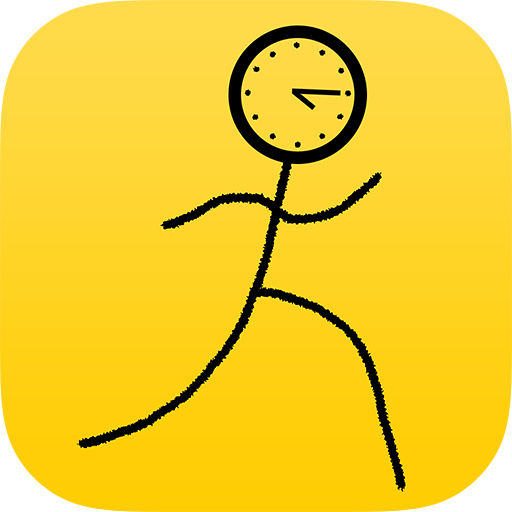
Making an icon for the App Store was another interesting endeavor. Since I have almost no knowledge of Photoshop, I searched around and found a cool website that lets you download a template for generating the icons called App Icon Template. I was able to use this to create a single image and automatically generate all the smaller images that were needed. Unfortunately all the templates in the world can’t immediately make me better at coming up with a logo idea or bringing that logo to life. However, once again I found myself adhering to the “weekend project” mantra and scribbled together an idea while waiting to leave the apartment on Sunday. While it was rough around the edges, I found myself liking it. I then polished it up a bit (still using my freehand mouse drawing with the exception of the perfect circle I could never draw) and patted myself on the back.
The App Store deployment was a bit of a hassle to figure out. Between the different profiles & certificates, iOS development already gives me a headache to try and manage all the necessary components of the developer lifecycle. Fortunately, they have submission process documented pretty well so I was able to simply follow that, but I had to spend quite a bit of time trying to figure out why different parts of my developer account weren’t showing up right when I was going through different wizards. I’m pretty sure just this part (tying up the loose ends related to submission and going through all the steps) took almost as long as the coding.
Building the website was the least difficult part of all this, since all I really wanted was a landing page with no interaction. I simply took a couple pictures I already had, tried my best to follow Apple’s App Store Marketing Guidelines, and dumped the single page of Bootstrap-styled HTML onto a GitHub Page. I did get to learn a bit about how to set the right meta tags for Twitter Cards and Facebook Sharing via the Open Graph protocol (which really just means, when you share the website on either site it shows a picture, title, & summary).
Twitter’s validator rejected my meta tags until the app actually passed review and was on the store, and I had all sorts of issues with Facebook’s validator disliking my og:image tag even though my image size was well over their minimum. I tried changing files types, changing where I was serving the image up from, etc. After doing a lot of Googling and coming across many others lamenting the same thing, I just gave up when it gave me a warning but still picked up the image I wanted.
The Review Process
For whatever reason, part of my interest in building an iOS app was to see what the end to end app submission process with Apple was like. It was actually pretty boring. After submitting the app, I had to wait 8 days for the review to happen. Once approved, the app just shows up on the app store. No interaction necessary from me.
Overall
Going through the process and finishing something was a nice boost for me, and has me ready to work on a couple other really basic ideas. There are a few tweaks I’d like to make to PaceMyRace, but since it has pretty basic functionality there isn’t too much necessary to add.


